


Ode to Chicago – My very first series of work.
After spending some time in Chicago last summer, I was overwhelmed and surprised at how quickly the city won my heart. But I was also inspired by her distinctive identity and integrity.
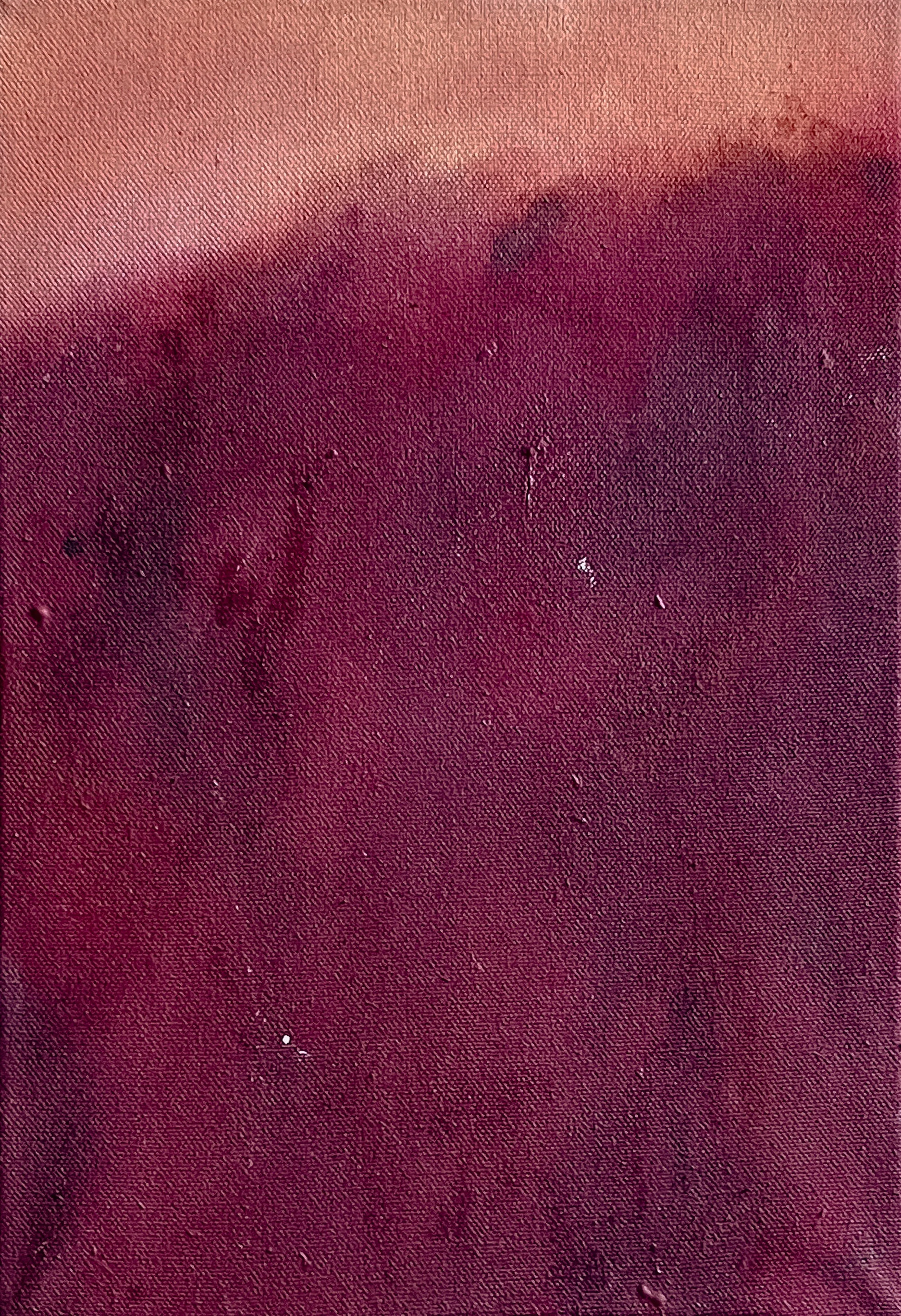
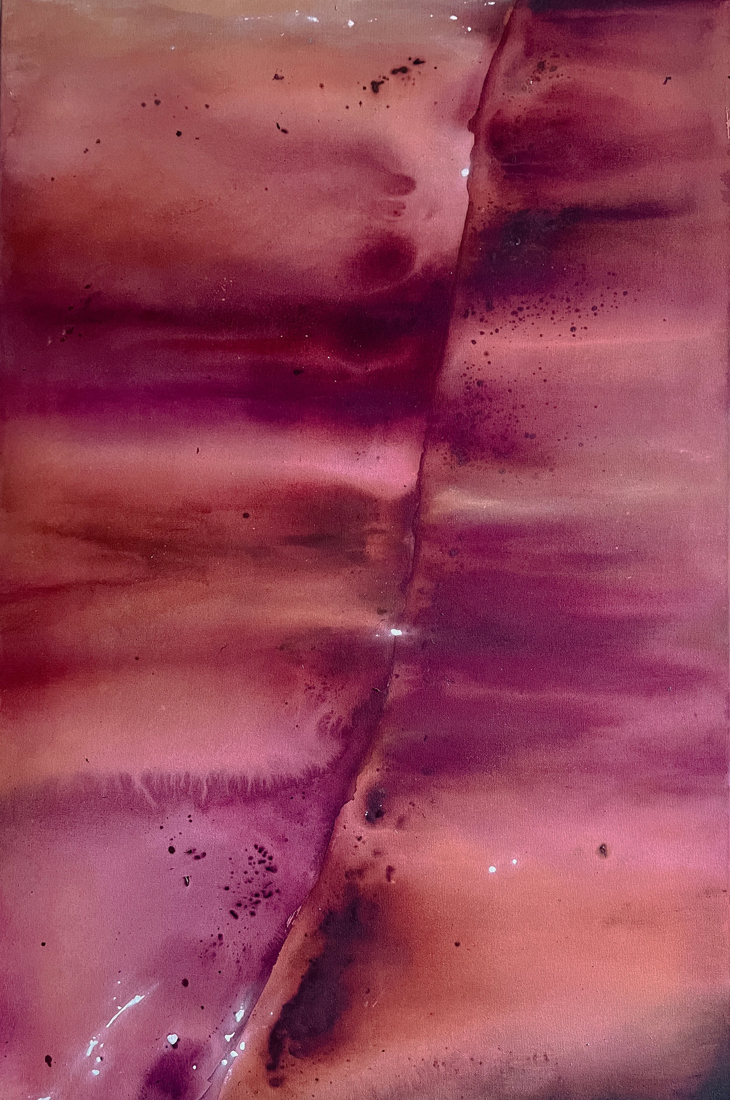
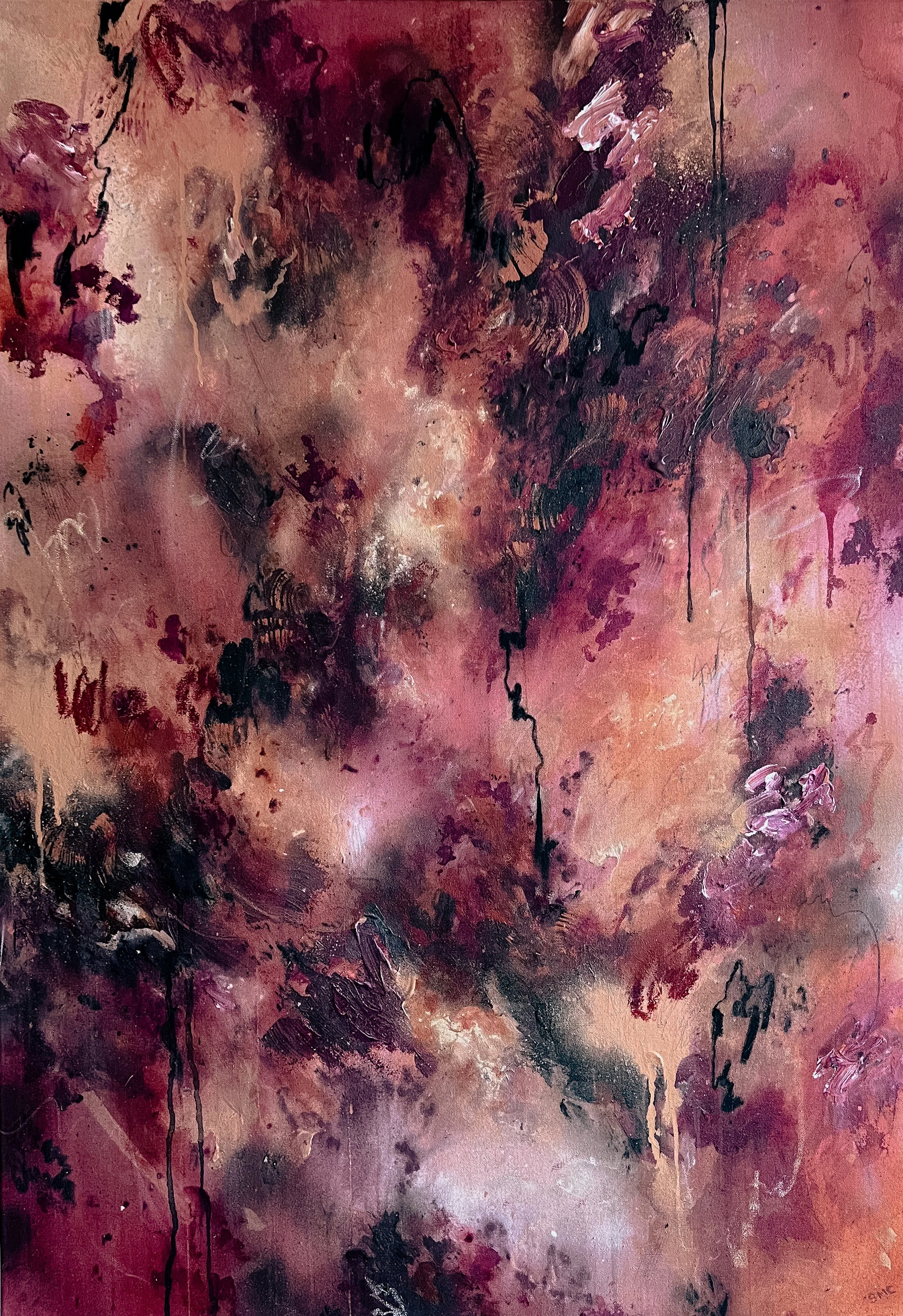
Chicago’s official colors are blue, white and red (go Cubs). But I soon discovered that her true colors are not constrained to those on her banner.
In fact, I would argue they are on display everywhere else.
There’s the red lead paint with a black powder tint acting as the unexpected thematic hue across the city – from her streetscapes to the most unexpected subjects (e.g., Italian subs and Styrofoam cups). However, they’re most prominently featured on the numerous bridges crisscrossing the Chicago River. Symbiotic with the rust running down the city’s surfaces, it demonstrates and embodies the true character of this town.
When I began to explore the idea of creating a series, I realized I pop culturally have ventured to Chicago unknowingly through out my whole life – creating a push and pull between the work. If ever in the neighborhood, go see her, she’s rad.